Thursday, 16 April 2015
Wednesday, 15 April 2015

Tuesday, 14 April 2015

Sunday, 12 April 2015
Evaluation Q3: What have you learned from your audience feedback?
Poster:
Magazine Cover:
Trailer:
Additional feedback:
Saturday, 11 April 2015
Wednesday, 1 April 2015
Ancillary Product: Audience Feedback on Poster
After finishing my poster after editing it to fit the improvements that my target audience suggested for my previous drafts, I decided to create one more questionnaire to make sure that my final product is effective. With this questionnaire I have decided to ask people from my school, aged between 16-18, a large chunk of our target audience. Below are the results:
1. Does the poster represent a supernatural horror genre effectively?
YES: ||||| |||||
NO:
2. Does the poster present the stereotypical codes and conventions of a real film poster?
YES: ||||| |||||
NO:
3. Does the focal image relate to the title of the film Occupied?
YES: ||||| |||
NO: ||
4. Does the colour palette used effectively link to the genre and focal image?
YES: ||||| ||
NO: |||
5. Do you feel the poster is memorable?
YES: ||||| ||
NO: |||
6. Is the poster eye catching?
YES: ||||| |||
NO: ||
7. Do you like the poster?
YES: ||||| |||||
NO:
8. Would you watch Occupied based off this poster?
YES: ||||| ||||
NO: |
I asked 10 people today. I decided to ask 5 boys and 5 girls in order to have mixed answers from both genders within my young adult target audience. As you can see from the final results that all 10 people that I asked liked the poster which I was really happy with. Also, all 10 people felt that the poster represents the supernatural horror genre clearly, and all 10 people felt that the poster presented the typical codes and conventions of a film poster. This meant that my target audience felt my design was effective at portraying the genre and resembling a professional and convincing film poster. The majority of my voters voted yes on all of the other questions, which I was extremely happy with.I was initially worried that my target audience may not find the poster eye catching due to the lack of bright colours on the poster, but from the feedback it is clear that this is not an issue and the colours can remain like they are.
Overall, I am happy with my final product poster and that it is clear to my audience that it is for a supernatural horror film and that it is convincing as a genuine film poster. As all of the people I asked said they liked the poster and that all but one said they would watch the film because of it, it is clear that my poster appeals to my target audience.
Tuesday, 31 March 2015
Ancillary Product: Making Changes to Magazine Cover (Draft 3)
 From reflecting on the feedback that I received for my second draft, it is clear that my audience still believe that some of the information (particularly the magazine name) needs to be more noticeable against the background focal image. To do this, I played and experimented with some of the effects and filters that are available on Photoshop and I came across the Burn tool (seen in the screenshot on the right). This tool allowed me to burn the top of the focal image so that became darker, meaning the magazine's name could stand out more.
The finished effect is pictured directly above. I feel like this added effect really makes the magazine's logo stand out a lot more than it originally did. As well as this, I think further creates an ominous look to my magazine cover, further making the cover look like a horror film magazine, as the Burn tool has meant that the top of the cover has been made darker, almost resembling a shadow; an icon of the genre.

 Another change that I made to the text on the magazine cover was changing the font for our film's name Occupied, so that it stood out against the focal image more, whilst still retaining a colour that fit within the cover's colour palette to keep a professional and uniform look. I decided to add an ombré effect on the text (the second effect on the second row in the screenshot on the right), and sampling one of the main beige/dull creamy brown colours that is featured within the focal image and applying it to the text. I feel this made it more noticeable against some of the other pieces of text on the cover, as it is the only one with an effect apart from the magazine name, as the title of the film should be one of the most important pieces of text on the cover as it is something the reader needs to know if they are thinking of watching the film. Also, effects like these make the overall look of the magazine more professional and interesting to look at for the reader.
Monday, 30 March 2015
Ancillary Product: Audience Feedback on Magazine Cover (2nd Draft)
After improving my magazine cover from the comments that I received after uploading it on Flickr, I then wanted to make sure that my next draft is definitely suitable and effective for my genre and target audience. Therefore, I have created a questionnaire that I can now ask people around my school, students aged 15-18, to fill in. I decided to ask a wide range of people in that age demographic, from different areas and social groups within my school, some who I may not necessarily be friends with so I can prevent any biased opinions. I also asked people who had previously given me feedback on my previous draft, as well as people who have not seen any other previous versions to further ensure that I have a wide range of feedback. Below are the results:
1. Does this magazine cover follow the conventions comparing it to other film magazine covers, such as Empire and Total Film?
YES: ||||| |||||
NO:
2. Does the focal image intrigue you and make you want to watch the film/read the magazine?
YES: ||||| ||
NO: |||
3. Is the cover eye catching?
YES: ||||| |||
NO: ||
4. Is it clear that the magazine is specifically a horror film magazine?
YES: ||||| |||||
NO:
5. Is all of the information featured on the magazine clear against the focal image?
YES: |||||
NO: |||||
6. Do you think the focal image effectively relates to our film's narrative and themes?
YES: ||||| ||||
NO: |
7. Is it clear that the film is a supernatural horror film?
YES: ||||| ||
NO: |||
8. Do you like the magazine cover?
YES: ||||| |||
NO: ||
I am fairly pleased with the results that I have collected based on my second draft magazine cover. It is clear from certain questions, 1, 4 and 6, that my magazine cover effectively resembles that of a real horror film publication, and that it represents the narrative of our film effectively through it's focal image. As the focal image is similar to a scene within the trailer in which Melissa and Josh are sat together on the sofa reassuring each other, I'm glad that our target audience picked up on this and felt that it was recognisable of Occupied and it's themes.
For question 3, it is clear that most of my target audience felt that my cover was eye catching, however, from looking at question 5 I can see that quite a few people felt that some of the information still got lost within the focal image, despite the efforts I made to make it stand out more. When asking about the response each audience member made for that question, many of them mentioned the magazine's logo and how they felt it should stand out more, similar to the feedback I have previously received. This means I am going to have to make further attempts at trying to make the logo and other information on the cover stand out.
For the other questions, the majority of my target audience voted yes and therefore I will take on board that my magazine cover is clearly for a supernatural horror film, that the focal image intrigues the reader and that many of my audience liked the overall product.
Sunday, 29 March 2015

Saturday, 28 March 2015
Ancillary Product: Making Changes to Magazine Cover (Draft 2)

 One of the changes I have made to my magazine cover after reflecting upon my audience feedback is changing the typography style of my magazine's logo to try and make it stand out more against the background focal image. I added an effect on the text that meant that it became more 3D, and added a fuzzy white and grey effect that resembles an analog television screen (something that is often seen within supernatural horror films as being quite creepy, iconically Poltergeist (1982)). I did this by choosing the second style on the bottom row in the screenshot shown on the right. This added a subtle whiteness to the font that I think makes it more noticeable against the focal image, whilst still remaining the dull, grey and ominous look I wanted for my magazine cover, as I didn't want to change it too drastically by making it a really bright and vibrant colour as this would contrast too much against the other colours featured on my cover and wouldn't maintain the iconic dull and ominous colours that are often associated with supernatural horrors.
 One of the main pieces of feedback that I received for the first draft was that there was a lack of information on the cover and that meant it looked quite bare and didn't persuade the reader to watch the film or buy the magazine enough. I have circled the extra pieces of information I have added in yellow on the image on the left. One of the main pieces of information that I have added is the film's title which is something that I completely forgot during the production of my first draft. I had to include this as this is a vital piece of information as I can't guarantee that all of the readers will recognise the image and "The Sanders" and automatically know that it is for Occupied. I also decided to put this information in white to make it stand out against the focal image and the other pieces of information which are in red, to make it clear that this is the main article featured within the magazine, that it is for the main focal image featured, and because the magazine's logo and the film's title are the two most important pieces of information on the cover. I decided to use the font used for the film's logo as well as this makes it recognisable for fans who have already seen the poster and the teaser trailer.
With the extra pieces of information, I incorporated the star system with the use of "James Wan" on the right hand third of the cover, a popular and acclaimed director of many successful supernatural horror films, thus meaning that horror fans will be attracted to the magazine as they will recognise his name and want to know why he is featured in it.
Ancillary Product: Magazine Cover Feedback (1st Draft)
I decided to ask our target audience and industry professionals what they thought about the first draft of my magazine cover. I decided to post my first draft on Flickr and below are some examples of the feedback that I received:
- "This magazine cover effectively resembles the conventional style of other film magazines such as Empire and Total Film."
- "The main focal image definitely helps me get an idea of what your film is about and it's narrative."
- "I really like this magazine cover, it's very interesting and the focal image is intriguing. I would include more information on it and make it more eye catching, making it more persuading for me to buy it. Other than that, the design and colour scheme are effective and make it look really professional, well done!"
- "I feel that the typography and colouring is really effective at capturing the supernatural horror genre. I would try to make the magazine's logo more eye catching and bold as it might be hard to notice from afar."
- "The use of conventional elements of other magazine covers make the product seem really convincing and professional. I would include much more information and features that would persuade the reader to buy it, and maybe use a different effect on the magazine logo as it needs to stand out more."
I have clearly received a mixture of positive and negative comments. Most of the comments established that I had captured the conventional layout of a film magazine and that the overall style of my first draft was very professional. One of my commenters said that they felt they were intrigued into what the film is about with the use of the focal image, and that it made them want to read the magazine to know more about it, which is what I really wanted with the use of the image. However, one commenter thought that the magazine's logo wasn't very clear and eye catching, which I agree with now that I have reflected upon it, and I will rectify this when developing my final magazine cover. A few of my commenters felt that the use of colours and the typography was effective at establishing that the film and magazine was about supernatural horror films, something that I really wanted to focus on as it is clear to me that the image could be quite ambiguous in what it is trying to portray and that it doesn't connote supernatural horror immediately. Now, I am going to focus on adding some extra information on my magazine as a couple of my comments alluded to the fact that my cover was quite bare, and I am going to work on making my magazine's logo stand out against the focal image more.

Monday, 23 March 2015
Ancillary Product: Focal Image (Magazine)
We took various shots of our main characters, played by myself and Tab, before producing our ancillary magazine product. Stereotypically seen on the front cover of a magazine is either the character or actor featured in the newly advertised film, which my previous research on film magazines has proven (e.g. Empire and Total Film). We chose to feature a long shot image of both Melissa and Josh for our magazine as their characters, as if we featured a normal image of our actors out of character, some of the audience may not know who they are as conventionally A-list Hollywood stars don't generally star in supernatural horror films. The shot we have chosen is of a scene that is featured within our film where the disequilibrium begins to happen, in which Josh is persuading Melissa that whatever bad things happened before are not going to happen again, and so this would be recognisable with fans of the film who are familiar with the narrative and the film's teaser trailer. We wanted to also make the location clear within our focal image to establish more of our narrative and where the film is set and this is why we chose to take our image in a living room, suggesting that they are a normal couple and makes it more relatable for our audience.


Saturday, 21 March 2015
Ancillary Product: Making Changes to Poster (2nd Draft)
 From reflecting on the feedback that I have received for the first draft of my ancillary poster, it's clear that my audience feel that there should be some more production information at the very bottom of the poster, with one suggesting that social media sites could be referenced here; a suggestion that I am interested in achieving. They also felt that this extra information would make my poster seem more professional and convincing. To do this I continued to use Adobe Photoshop and it's text and shape tools to create this information (screenshot and circled on the image on the right).

Another convention that I noticed a lot of film posters abide by is including the production company logos at the bottom as well. I decided to make them exactly the same as seen in my trailer as it saved a lot of time, but it also makes them identifiable for the audience and fans. I copy and pasted the logos that I created in Adobe Premiere (pictured below) and imported them into Photoshop to then scale them down and list them at the bottom of the poster.

One of the most important pieces of information that I wanted to include at the bottom of the poster, which one of my audience commenters suggested as well, was social media references. To do this I searched for the logos of both Facebook and Twitter on Google, so I could then include these next to the url/hashtag. The addition of these logos would then make it recognisable and more noticeable for the audience. The images I chose are featured below.


Both of these images had to be .png files so that their backgrounds would be transparent, meaning that the logo would like it is a part of the poster more, as a white border around the logo would look unprofessional and amateurish. I also had to be careful retrieving images from Google, especially as they are logos of big corporations, as included it on my poster could breach copyright laws. However, as I retrieved these images from a page on their sites that allows you to download their logos for promotional purposes, copyright isn't an issue.
Friday, 20 March 2015
Ancillary Product: Poster Feedback (1st Draft)
I decided to ask our target audience and industry professionals what they thought about the first draft of my poster. I decided to post my first draft on Flickr and below are some examples of the feedback that I received:
- "An extremely good piece. I think you could do with some extra production information at the bottom either side of the release date as it looks slightly bare. This would make your poster fit to the conventions more. Maybe some social network references?"
- "The effect on the image is successful at portraying the horror genre. I really like the 'ghostly' effect used. Well done!"
- "It is clear straight away that this poster is for a supernatural horror film. I would maybe use a bit of red or something as that is a really conventional colour but other than that, it's great!"
- "Amazing poster."
- "I really like how all of the colours are very uniform and professional as they all fit within the same colour palette. There are also only three fonts used throughout, also giving it a uniform and professional look."
- "I wish this film was real! Looks amazing!"
- "Maybe include some extra information at the bottom as it looks a bit empty right near the bottom."
- "This poster is clearly for a horror film. I love the focal image as it is intriguing and mysterious, as we don't know who the man is. Makes me want to watch the full film!"
Luckily I received a lot positive feedback for my poster. However, one commenter felt that there should be 'a bit of red' featured within our poster. I disagree with this comment as I feel including red within the poster's design would contrast against the uniform look that I have tried to achieve with the dull beige colour and black throughout. As another commenter agreed with me and liked how the poster looked uniform and professional, I am going to ignore the 'red' comment. One suggestion that I thought was a great idea was too include some extra information at the bottom of the poster, specifically social networking references, so I will be doing this when producing my next draft. Other than these, my first draft received a lot of positive feedback which is highly reassuring, as time to finish this project is becoming quite limited now.
Thursday, 19 March 2015

Wednesday, 18 March 2015
Planning/Production: Script for New Shots
The new shots that we want to film, have to include dialogue from our main protagonists as this one of the main pieces of feedback from our target audience for our first draft was that their was a lack of dialogue from the characters and that it affected how clear the narrative of our film was to them. Shot number 5 in our storyboard consisting of the news shot in my previous post, will include the main piece of dialogue/narrative that will be added into our teaser trailer:
JOSH WALKS QUICKLY PAST THE STAIRCASE.
JOSH: Melissa!? ... Melissa!?
JOSH SUDDENLY STOPS SHOUTING, AND A WORRIED LOOK APPEARS ON HIS FACE.
(the faint ambient sound of a chandelier moving in the background)
JOSH LOOKS UP. THE CHANDELIER IS MOVING ON ITS OWN.
We feel this will effectively grab the audience's attention more as we have extended the original shot where Josh originally looks up at the chandelier, to incorporate dialogue, a dramatic and tense silence, and a longer realisation expression from Josh, which all establish that there is something eerie and bad about this house, a lot more than the quick sudden shot from our original rough cut. It intrigues the audience more, making them want to watch on and eventually want to watch the full film, and makes them on the edge of their seat thanks to the added tension, a conventional element in supernatural horror films and trailers.


Tuesday, 17 March 2015
Editing: Lack of Shots
Whilst editing our teaser trailer, Tab and I have realised that from both our observations, feedback from our target audience and from industry professionals, that we lack some scary and creepy shots towards the end of our teaser that would add much more tension and be more conventional of other supernatural horror trailers. In light of this, Tab and I have discussed what sort of shots that we want to include and we are going to create a storyboard of the new shots we are going to film over the next two days.
As our teaser trailer is also only 55 seconds long as well, we feel these extra added shots and narrative will make our trailer closer to our target length of 1 minute 30 seconds.
As our teaser trailer is also only 55 seconds long as well, we feel these extra added shots and narrative will make our trailer closer to our target length of 1 minute 30 seconds.
Editing: Making the Ident
After researching some distribution and production company idents from the beginning of other teaser trailers, my partner and I have come to creating one for our film that represents our film's narrative and theme, whilst also resembling a conventional ident. We decided to edit it in Adobe Premiere as we were familiar with how to create different titles and how to work with fonts, effects and backgrounds within the programme. For example, the background image for the 'TC Productions' ident on the right was originally much brighter and had a much happier look to it, but due to the effects available, I was able to reduce the brightness of the image and add a cinematic filter to create a much darker and ominous look that resembles our film's narrative effectively.
 |
| The edited image of clouds, with added dark cinematic filter and reduced brightness. We edited the background images in Adobe Photoshop. |
 |
| The making of our logo for the 'TC Prodcutions' ident. |
 |
| The logo and background image edited together. We added a circular shape around the text that had a shadowed effect and created an eclipse look, an image that is often featured within horror films. It also gave it a professional finish. |
We decided to keep this ident fairly simple with a neat and clean design. Bad weather is an icon of the supernatural horror as it is a form of pathetic fallacy and foreshadows the bad events that are going to happen in the film's narrative, this is why I feel the edited cloudy background image is effective for this ident and our film. Clouds are also iconic for idents and are often used for some major production companies, for example; Paramount Pictures and Dreamworks, and so it makes ours more identifiable as a conventional ident. As it is simple, it is memorable for the audience and would be recognisable for fans of the genre. We decided to call the production/distribution company 'TC Productions' as it is a typical name for other production companies (e.g. Eon Productions), to use the word 'productions' within it's title. The use of 'TC' is quite catchy along with the word productions and also makes it memorable for audiences, as a lot of production company names are. The font used was kept simple and ambiguous in terms of genre, as commonly, many supernatural horror films are produced by companies that do not specifically produce horrors, for example, Stage 6 Films that produced Insidious (2011), also produced film's such as Her (2013) and Austenland (2013), both romantic-comedy films.
 |
| The edited image that has been given a black & white filter. |
 |
| The logo with the background image. We decided to give this ident a more supernatural horror feel to it. |
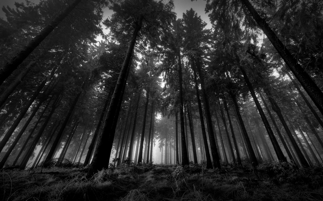
We decided to create two different idents to use in our teaser trailer, as we found from our research that many films are not produced by just one production company and therefore more than one ident is often featured within their trailers. For this ident, similarly to the first, we wanted to make it quite simple so it remains memorable for our audience. The background image we chose was of a dark and spooky forest as they are icons of the supernatural horror genre and makes it identifiable for the audience, and we decided to add a black and white filter to the image in Photoshop to make this even more clear to the audience as black and white filters are conventional of the genre, and make images look more eerie and ominous. We decided to call this production company 'Paranormal Pictures' as it is a clear link to our supernatural horror genre as paranormal experiences are an icon of the genre, plus the use of pictures within the name creates alliteration and again makes it more memorable. The fact that the beginning and end letters of each word are in upper case give the ident a more professional and sophisticated look.
Editing: Inter-title Ideas
For our supernatural horror teaser trailer, Tab and I are planning to have about 3 or 4 inter-titles throughout as these are conventional of trailers to establish the narrative and give extra information about the film, such as actors, producers and and any previous films that the film sequels. These inter-titles will appear in between a range of sharply edited, fast non-linear shots of the film's narrative, to create a tense build up to the trailer's crescendo and to not give away the film's plot completely so that it intrigues our audience. Our objective is for the inter-titles to include our film's tagline, and make the audience think of how they could relate to the film's narrative.
Here is our initial idea for our inter-titles:


Here is our initial idea for our inter-titles:
- From the makers of 3:17AM
- Based on true events
- Sometimes evil...
- ...is closer than you think
We feel that these inter-title ideas are effective in successfully hinting to our audience the narrative of our supernatural horror film without revealing too much and instead intriguing them and making them watch our film. We have also used conventional techniques such as saying that the film is from the producers of another film (3:17AM was the name of last year's project), therefore attracting fans of that film. Another technique was to say that the film is based on true events, which is specifically conventional of supernatural horror film trailers as it is effective at scaring the audience into thinking that if the events in the film happened to real life people, then it could easily happen to them. It also makes the film's narrative feel a lot more realistic.
Below are some ideas for how we want our inter-titles to look like in our final trailer:
The font used is serif, which gives it an eerie and creepy feel and relates to the old-style house setting as serif font has connotations of being quite old fashioned. I like the red font and how it contrasts well with the dark background and stands out. Plus, red is a conventional iconic colour of the supernatural horror genre as it has connotations of danger and blood, foreshadowing the events that are to come in the film and hinting the fate of the main protagonists in our film to the audience.
We have decided that we are not going to include the actors names within our teaser trailer as this goes against the conventions of other supernatural horror films, as generally well known actors rarely star within the genre as they often have low budgets and are made by small, low-budget production companies who can't afford A-list celebrities. Including the names of actors who are not well known would be pointless as they wouldn't attract any of the audience because they wouldn't have any fans who would just go and see the film because of them.
Production/Research: Inter-titles - Insidious: Chapter 2 (2013)
What I liked about Insidious: Chapter 2's inter-titles:
- The typography linked in with the film's title, giving the whole teaser trailer a uniform and professional look.
- The use of red for the inter-title font was a conventional way of establishing the genre and suggesting that their will be danger in the film's narrative.
- The inter-title background looked dark and ominous, representing the themes throughout the film.
- Like Sinister, the use of establishing what other films the producers of this film have worked on.
- At the end of the trailer, establishing that the film is specifically released on "Friday the 13th", instead of just saying the 13th of September relates to how the characters within the film may be unlucky as Friday the 13th is stereotypically when people are likely to get bad luck. It also adds a sense of risk for the audience as it makes them feel that something unlucky could happen to them if they see this film, a feeling that fans of the genre thrive on when going to see a horror film.
Production/Research: Inter-titles - Sinister (2012)
What I liked about Sinister's inter-titles:
- The use of production information and including previous films from the same producers, persuading fans of those films to watch this one.
- The design of them looks derelict and old-fashioned hinting at the narrative and location, something that we would like to do within our titles.
- The use of a tagline that can be used in all of our products that intrigues the audience, making them watch our film.
Monday, 16 March 2015
Editing: Re-filming
After we uploaded all of our footage on to our computer and imported into Premiere, it's come to our attention that some of the shots need to be extended and developed to create more of a narrative structure within our teaser trailer. We specifically need to focus on the shot where Josh looks up at the chandelier moving, as we and our target audience felt that this was too much of a quick transition between the happy beginning and the supernatural occurrences. Taking this on board, when re-filming in the coming days, we are going to add a shot where Josh is calling for Melissa at the bottom of the stairs and then there will be a moment of realisation before he looks up after hearing the chandelier moving. There will also be no incidental music in this shot either, as it creates tension and the ambient sound of the chandelier moving adds an eerie and foreboding effect that then smoothly transitions into the more intense action shots later in the trailer. We feel this added bit of narrative clearly shows the disequilibrium in our film and contrasts much more clearly to the happy start, thus making it more similar and conventional to other supernatural horror trailers.
We are going to create a storyboard of our re-filmed and new shots so that we can film as soon as possible.
We are going to create a storyboard of our re-filmed and new shots so that we can film as soon as possible.
Ancillary Product: Initial Poster Layout Draft

I will be using a mixture of InDesign and Photoshop when creating my poster, InDesign helping us layout the poster the way we want it and a way that is conventional of other posters, whereas Photoshop will help us manipulate our main focal image to fit in with the dark theme and atmosphere that we are wanting for our film and that is conventional for supernatural horrors.
Planning: Narrative Structure
Our trailer begins with a couple, Josh and Melissa driving up towards their new home they are just about to move into. The very first shot is of a car driving up a driveway, this self-tightening shot is also an enigma shot, as it allows the audience to question who the two characters are, their background, and most importantly, where they are arriving (especially as the establishing shot of the house only appears after three shots of various things around the location i.e. trees, swinging gate). It effectively sets the scene and raises narrative questions for the audience as they are unaware of the couple's fate and what other things will happen next. It also misleads the audience slightly, lulling them into a false sense of security (a technique used conventionally in many supernatural horrors), as the shots are filmed in bright and sunny conditions, connoting happiness and joy; something that changes dramatically in the disequilibrium to come.
One of the next shots shows Josh, in an over the shoulder shot, talking to Melissa and saying that everything that happened last time won't happen again. This is also another enigma shot as it raises questions for the audience as they are unaware of what has happened to them before, again making them want to watch on and also eventually watch the full film. After the first inter-title, a shot of Josh calling for Melissa and realising the chandelier is moving on its own is an action code, as it shows how the plot is now moving on and more of the narrative is being revealed. It tells the audience that something bad is now going to happen as the characters are reacting to something that is clearly out of the ordinary for them. This action code also marks the beginning of the disequilibrium, as this is the first glimpse at the supernatural occurrences that then continue until the end of the trailer/film.
The use of enigma and action codes are both conventionally used within teaser trailers as they set up the scene for the viewer and then show clear moments that resemble key changes within the film's narrative, whilst not giving away too much of the plot. Because of this, we have used these codes within our teaser trailer.
Planning/Editing - Soundtrack 1
From looking at my research and the conventional soundtracks used in supernatural horror film teaser trailers, Tab and I have decided upon the soundtrack above to be used at the very beginning of our trailer. We wanted to have a generally happy soundtrack at the beginning of our teaser as we found it is conventional for many trailers to begin with a generally happy and uplifting mood as it contrasts against the bad things that happen later on, and lulls the audience into a false sense of security. An example of a teaser trailer that uses the same technique is shown below (Insidious: Chapter 2, 2013).
We will use this happy ambient music when Josh and Melissa turn up to their new house and are hopeful of their new start, leaving the bad things that happened to them behind at their previous home. The track is effective as it isn't overly cheerful and upbeat as this may have ruined the complete atmosphere that we wanted for our teaser trailer and make it seem quite comical. The track we have chosen is a guitar which has been manipulated so it is playing backwards, giving a subtly positive tone, whilst also staying in theme with the ominous atmosphere we want to create later on in the trailer.
Planning/Research: Film Title Font Testing
| |||| = 4 |
 |
| ||||| ||||| | = 11 |
 |
| - |
| ||| = 3 |
 |
| |||| = 4 |
Planning: Film Title Font

The first font that we have chosen looks like shattered glass/mirror, an icon of supernatural horrors and something that is often seen within the genre. It also has a derelict and destroyed feel and look about it, also a motif that is conventionally featured within the genre and also links back to our narrative and the fact that our setting is an old and eerie looking house, also representing the rocky ride that the couple are going to be experiencing in the film.
This second font uses a nice balance between serif and sans serif, as it uses a subtly serif design, whilst still retaining it's bold and eye catching look. One thing I particularly like about this font is the design on the U and P within the title, as it almost looks like blood being wiped across in different directions. This also makes the Occu and the pied almost look separated from each other, foreshadowing the narrative within the film for the audience as a rift comes between our couple, Josh and Melissa when Josh becomes possessed by this ghostly demon. We think it would also attract our age range as it isn't too old fashioned and sophisticated for it to not appeal to our young adult target.
The third font that we have chosen is a serif font with blood dripping from the letters. This font is effective at linking back to our narrative of our setting being an old and eerie house, as serif font generally has connotations of being old fashioned. However, one problem with this font could be the excessive use of blood as although blood is an icon of the genre, it isn't a key narrative feature within our film and would maybe more suited to the slasher sub genre.

The fourth font that we have chosen is a serif font that letters almost look pointed and daggered at the ends, which is effective as blades and knives are an icon of the horror genre. It also, similar to the third font, connotes an old fashioned and eerie feel that relates to our narrative setting.
Like the font above, this font is in a serif style that links back to our old and eerie setting. However, this also incorporates a derelict and neglected feel to it as the letters are slightly rough around the edges, again representing our location and the turbulent experience that our main protagonists are going to go through in our narrative. We think this is also a font that effectively targets our target audience as it isn't as sophisticated and old fashioned as the font before that may have attracted an older audience instead of a young adult one.
We are now going to target audience test these fonts and see which one of them best suits them and our film's narrative effectively.
Sunday, 15 March 2015
Research: Idents

Above is the ident for the production company, Lions Gate Entertainment. The main background image used in this ident is clouds, with the image getting lighter in the middle where the text is, almost as if the sun is shining through the clouds. A light ray is also peaking through the middle of the logo, also suggesting that Lions Gate is a source of light and happiness, reflecting their films and how it makes their audiences happy. The way that the image is lighter around the text makes the ident seem quite grand and bold, with the dark clouds around the outer edge making it seem that Lions Gate is bringing light and sun, and making everything better and happier, again reflecting their films. In addition, the ident almost seems religious as it looks like an iconic image of God being above the clouds in some heavenly, whimsical place, and this could relate to how they are trying to portray the production company as the best, and a leader in the film industry that everyone (audiences) look up to. The typography used is very bold, and the bright blue stands out against the grey cloudy background, almost contrasting the light blue sky colour with the overcast sky. It also has a 3D effect that again makes it stand out against the contrasting background, and almost makes it seem that the logo is jumping out at the audience.
| A variation of the ident used for The Possession (2012), a supernatural horror film, and that maybe would be more suited for our film's trailer due to the use of dark colours, including red - a colour that connotes danger and blood, an icon. It also looks like fire, which is something that features in our trailer and so this could be an effective link. |
One thing that we are definitely looking to take away from this ident is the use of the clouds, as I think they are effective at creating an epic and spectacular image for the ident that is memorable for our audience. Plus, clouds are an icon of the supernatural horror genre as they create an eerie and ominous atmosphere conventional for the genre, and identifiable for fans.
The second ident I have researched is one of Hollywood's Big 6, production company Paramount Pictures. The main background image incorporates clouds, much like the Lions Gate one previously, and here they are used in a similar way to show that they are above any other production companies, and that they are the best. The main image is of a mountain, which relates to the 'mount' part of the conglomerates title. This makes it look like Paramount is a powerful production company with the use of this powerful image suggesting that they are atop the tallest mountain, something that no other company can do. Climbing mountains and getting to the top of them is seen as a very difficult thing to do and is often celebrated when someone achieves it, however this image suggests that Paramount do this regularly and are used to being able to get to the top with their films, despite it being difficult for other production companies to do so. The use of the stars circling the text suggests how they are a prestigious company that is often praised, and the stars almost refer back to the 5 star rating system that many reviewers use, or the stars on the Hollywood Walk of Fame, suggesting to the audience that they are the best. The typography is quite sophisticated and elegant, and almost looks handwritten, however for our film, this style of writing wouldn't be effective as it is often has connotations of being related to romance and it may also not attract our young adult target audience. Although I believe it works well with this ident, as it fits in with the epic and detailed background and the way it is presenting itself as the best and prestigious.

The third ident I have researched is a production company that specialises in horror films, Blumhouse Productions. This ident is much different from the ones I have previously looked at as it doesn't present itself as being an epic and spectacular, prestigious company, but instead focuses on the genre that they work within and presenting that to the audience. The background image is of the corner of a room, in which the walls look dark, dirty and derelict, resembling the sort of locations that many supernatural horror films are set. The typography incorporates a house with the H, also suggesting and linking that many horror films are actually set in houses as it makes it more relatable for the audience. This would also be effective for our film as ours is set in a house, and incorporating a house into our ident is now something that we are going to consider.
Research: Film Titles

The title above is from the 2011 supernatural horror film, Insidious. The title is on a dark brown/black background which is conventional as dark colours connote eeriness and scariness, both constant themes throughout the genre. It also appeals to an audience of both males and females as from my research, both genders generally watch horror films and so it doesn't single out a certain demographic. The font is in a dark red which stands out against the dark background. Red has connotations of danger, and also resembles blood, an icon of supernatural horrors. It is also in a serif font, with parts of each letter sharply jutting out at the ends, slightly resembling daggers and blades - both of which are icons of the genre. As the typography is 3D, shadows are being cast over some of the letters, giving it a dark and mysterious look. Shadows are an icon of the supernatural horror genre as they have connotations of mystery and the nighttime, a typical setting for horror films. Insidious is set around a family who are moving into a their new home which unbeknownst to them, is haunted by a ghost after their child. This means that this film title style would be very appropriate for our film as they both follow similar narratives, although in Insidious, a devil demon is a main antagonist and this could be why the title is in bright red with sharp horns coming from the letters, meaning we may need to think of a slightly different style to fit our film's narrative perfectly.

The second title is from the 2013 supernatural horror film, The Conjuring. This a slightly unconventional film title style than most supernatural horror films as it doesn't use the typical styles and colours that other films use. Firstly, the background of the title is a dull, moody colour which almost looks like an overcast sky. Dull colours are often used within the genre as they represent the dark narrative that is to follow in the film. Also, the use of a background which resembles an overcast sky is also conventional as bad weather is often seen within the genre as a way to foreshadow the bad things that are going to happen in the film's narrative. The font is in a serif style, which has connotations of an old fashioned time and setting, both of which are common narratives within the genre, and also hints to the audience the film's narrative. It is also conventional for supernatural horrors to use serif font for their titles as they create a more ominous, serious look and tone that reflects the happenings in the film. The title has an overall ambiguous look to it as from first glance, you wouldn't immediately think that it is for a supernatural horror film which may not immediately attract fans of the genre, but cause intrigue and interest into what the film's really about and make them want to go and see it. We may consider using a font and style like this title as we think it is effective at setting a dark and ominous tone, however, we may include some more striking colours to make it stand out to our target audience more, and to make it more identifiable as a supernatural horror film for fans. We may include a sentence underneath the title like the one above, stating that it is based on true events as this is very conventional of the genre as it intrigues the audience as it makes the narrative seem more believable and thus making them think it could happen to them.

The third title is from the 2014 supernatural horror film, Annabelle. The typography used for this title is similar to the ones I have previously looked at, the conventional serif font which has connotations of an old fashioned setting, a typical setting for the genre, and it also sets a serious and ominous tone. It immediately attracts fans of the genre as many supernatural horrors use the same style of font, and so it is identifiable for them and is something that they expect and want to see. Also, the background is what looks like a wall with old fashioned wallpaper on, hinting to the audience the setting and narrative of the film, and also linking to the old fashioned style of font used. The 3D effect on the title casts long shadows of each letter across what looks like a wall as the background. These long shadows creates an ominous and dark effect, and plus shadows are an icon of the supernatural horror genre. The use of various shades of dark blue as the titles main colour palette creates a cold and dull look and atmosphere, which hints to the audience the film's narrative. We think this style for our title would be effective, although we think we may use a red colour instead as this is overall more striking and conventional of the genre. Although, we may still use a dark and old fashioned background as this creates the ominous atmosphere that we also want to create in our teaser trailer.
Subscribe to:
Comments (Atom)