 |
| The edited image of clouds, with added dark cinematic filter and reduced brightness. We edited the background images in Adobe Photoshop. |
 |
| The making of our logo for the 'TC Prodcutions' ident. |
 |
| The logo and background image edited together. We added a circular shape around the text that had a shadowed effect and created an eclipse look, an image that is often featured within horror films. It also gave it a professional finish. |
We decided to keep this ident fairly simple with a neat and clean design. Bad weather is an icon of the supernatural horror as it is a form of pathetic fallacy and foreshadows the bad events that are going to happen in the film's narrative, this is why I feel the edited cloudy background image is effective for this ident and our film. Clouds are also iconic for idents and are often used for some major production companies, for example; Paramount Pictures and Dreamworks, and so it makes ours more identifiable as a conventional ident. As it is simple, it is memorable for the audience and would be recognisable for fans of the genre. We decided to call the production/distribution company 'TC Productions' as it is a typical name for other production companies (e.g. Eon Productions), to use the word 'productions' within it's title. The use of 'TC' is quite catchy along with the word productions and also makes it memorable for audiences, as a lot of production company names are. The font used was kept simple and ambiguous in terms of genre, as commonly, many supernatural horror films are produced by companies that do not specifically produce horrors, for example, Stage 6 Films that produced Insidious (2011), also produced film's such as Her (2013) and Austenland (2013), both romantic-comedy films.
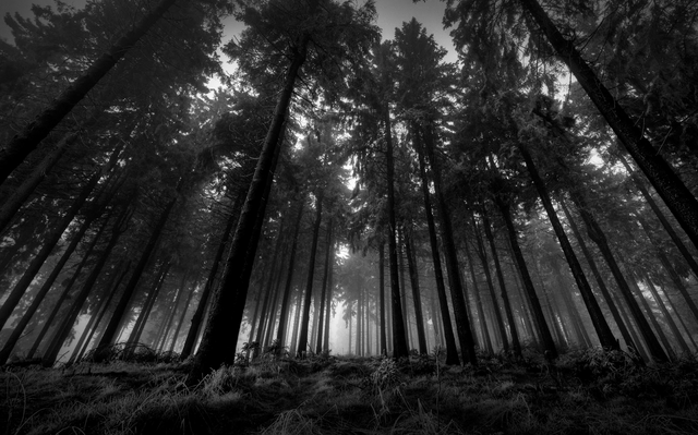 |
| The edited image that has been given a black & white filter. |
 |
| The logo with the background image. We decided to give this ident a more supernatural horror feel to it. |
We decided to create two different idents to use in our teaser trailer, as we found from our research that many films are not produced by just one production company and therefore more than one ident is often featured within their trailers. For this ident, similarly to the first, we wanted to make it quite simple so it remains memorable for our audience. The background image we chose was of a dark and spooky forest as they are icons of the supernatural horror genre and makes it identifiable for the audience, and we decided to add a black and white filter to the image in Photoshop to make this even more clear to the audience as black and white filters are conventional of the genre, and make images look more eerie and ominous. We decided to call this production company 'Paranormal Pictures' as it is a clear link to our supernatural horror genre as paranormal experiences are an icon of the genre, plus the use of pictures within the name creates alliteration and again makes it more memorable. The fact that the beginning and end letters of each word are in upper case give the ident a more professional and sophisticated look.
No comments:
Post a Comment